They say that the indigenous peoples in the Arctic have over one hundred words for “snow.” We who live in the more temperate climates have perhaps two or three words for “snow,” such as snow itself, ice and slush. That is not surprising given the great importance what that word signifies has for those living in the Arctic, and the minimal importance that it has for those living in warmer climates.
The Significance of the Color Blue in Men’s Lives
When it comes to color, its importance is often gender related. Men see color, if at all, as simply red, blue, green, etc. Women on the other hand are acutely aware that colors come in different shades. Yet color plays a much larger role in men’s lives than they are aware or want to admit. And this is no more so than with the color blue. If a man can only own one suit it must be a Dark blue suit, which can be used for both business and more formal occasions. And if a man can own only one sports jacket, it must be a Navy-blue blazer that can be dressed both up and down.
The color blue signifies both trust and authority: two qualities that are usually associated with men. And for that reason it should not come as a surprise that around the world most police forces and navies have dark (Navy) blue uniforms. Furthermore, the shade Royal Blue was commissioned by a king to celebrate the power and authority of the monarchy.
More than Two Hundred Shades of Blue and Counting
If there are fifty shades of gray, there are more than two hundred shades of blue. Let’s see how we can get some of those shades to work for us on Zoom and other video platforms. Below is a Dark blue suit paired with a Light blue shirt.
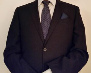
You could pair this suit with a White shirt, which is always acceptable, but I think that the light blue shade gives the combination more elegance. Unfortunately, Light Blue appears almost white on video; so let’s pair it with a French-Blue shirt—one of my favorite shades of blue—which takes it to a another level.

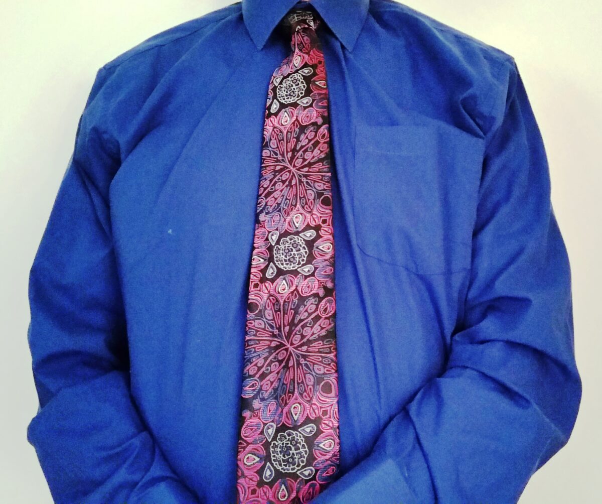
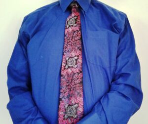
Another interesting shade of blue is Cobalt Blue. This shade conveys intelligence and conservatism, but it can be a fun color, too. Below a Cobalt-Blue shirt is paired with a funky tie: perfect for the clubs and parties.
Expanding Our Color Palette
Most of your favorite TV-shows have a Color Palette. These are the colors that the stylists for the show believe best convey the show’s mood and theme. Let’s see how we can expand our own color palette for maximum impact on Zoom.

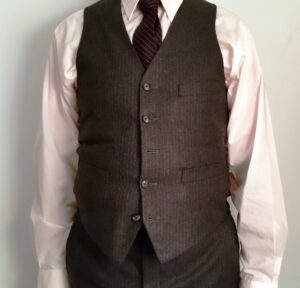
Above we have a man in a three-piece suit. He wears a White shirt, perfectly acceptable. But for Zoom White is a color that lacks a punch; so let’s dial it up a notch or two with a warmer color, say Pink. Unfortunately, this color, which I occasionally wear in a shirt as a substitute for white, reproduces n Zoom almost as white, as you can see below.
So should we go with another color that cries out for attention? Or should we try something more subtle?
I think that we should try the latter; for a more intense color would clash with the conservative nature of the three-piece suit. How about trying a pattern? And that’s just what I did below. I went with a Wide-Striped shirt that I believe will create a far more interesting picture on Zoom, without nullifying the conservative look of the wearer.

How to Inject Some Excitement into Your Business Casual Look

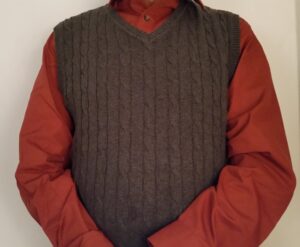
Above we have a Light-Red patterned shirt matched with a Charcoal Gray sweater-vest. The sweater-vest is an excellent choice for Zoom because it displays more of the shirt and its color.
Charcoal Gray is a great color because it can go with almost anything. Furthermore, this sweater-vest is cable stitched, which gives it a more interesting visual quality. You should definitely stay away from an Argyle sweater, or anything with a busy pattern. The problem here, though, is the color of the shirt; it’s too muted for Zoom. In fact, it looks more pink than red. So I went bolder. Much bolder. I went with a color called Persimmon, which gives the ensemble a real kick, as you can see below.
The problem of light colors looking somewhat washed out on Zoom is not exclusive to Red. The same degradation of color can be found with Lavender, which is shown below.
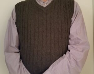
It’s certainly a lovely color, but it’s too muted for Zoom; in fact it looks almost Gray. So again I went bolder; this time with a color called Purple Velvet, which you see below.
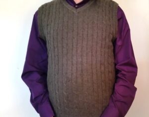
Quite frankly, I wasn’t particularly thrilled with the fit of the shirt, but I think that the bolder color does work. By the way, for those of you who live in a somewhat warmer climate (as opposed to the Northeast), this sweater-vest is actually made of cotton, which might be appropriate for you on colder days.
Color is essential to your look. Be sure to take advantage of it on Zoom.
